
Hello,
My name is Chris and I’m Group Lead of Digital User Experience and Innovation at Domino’s Pizza Enterprises.
I have over 10 years of experience in UX/UI design and leading teams across e-commerce platforms, web experiences, native apps, EDM/Marketing design, AR/MR and voice interfaces.
I thrive in a fast paced, rapid turnaround environment, where iteration, testing and learning from the user is key. I take ambiguity in my stride and live for designing great work that is open to everyone.
I can be ready to work in the United States in 6-8 weeks, including notice period.
Find my portfolio below - this is very much a snapshot, and by no means exhaustive - if there’s a specific area you’d like to know about my experience in, please feel free to get in touch.

Domino’s for Apple Vision Pro
iOS | VisionOS
Domino’s Design System extended to Apple Vision Pro

We begin with the Service Selection - presented here as a modal. By asking this question up front, we can present accurate pricing, offers and store details to the user for the rest of the conversion flow.
Old and new
As spatial computing becomes an area of intense focus for Apple and Meta, I’ve started exploring how Domino’s can extend out existing experience to AVP, taking advantage of the spatial canvas, and new interface elements.

A product card - staple to the Domino’s Design System, presented on VisionOS as a modal, leveraging depth and focus effects.
The new experience draws from iPad designs and the web experience. Key to the hierarchy of the menu is the presentation of the product page as a modal stack. This focuses the user into the task of exploring and customising the product, whilst still feeling present to the greater menu, with the basket remaining glanceable in the background.

The VisionOS experience draws structure from the Domino’s web ordering platform
Intensely focused
Product images in the main menu are increased in size, and control sizing is also scaled up for the new experience. In line with the VisionOS HIG, the number of CTA colours has been reduced to one (the buttons with a purchase action attached) and buttons which would have traditionally carried a secondary colour adopt a de-emphasised.tone. Tabbed navigation is relocated to the left side of the view, re-architected for a top to bottom hierarchy. Product cards lose their outline, with it now appearing as part of the hover effect when focused on.

The menu view on Apple Vision Pro, showing a in-menu hover state to show user selection
Check this out…
The check-out flow, previously presented full screen as a linear flow now also appears as a multi-level modal stack, allowing customers to check out with confidence, before moving to the order tracking experience, powered by native Apple Maps.

And we’re just getting started
This is a very early design, with a view to get our bearings on the platform before it launches in any DPE markets. As we understand more about how users engage with Vision Pro, we’ll revise and enhance these designs to bring the best possible experience to this new, exciting platform.
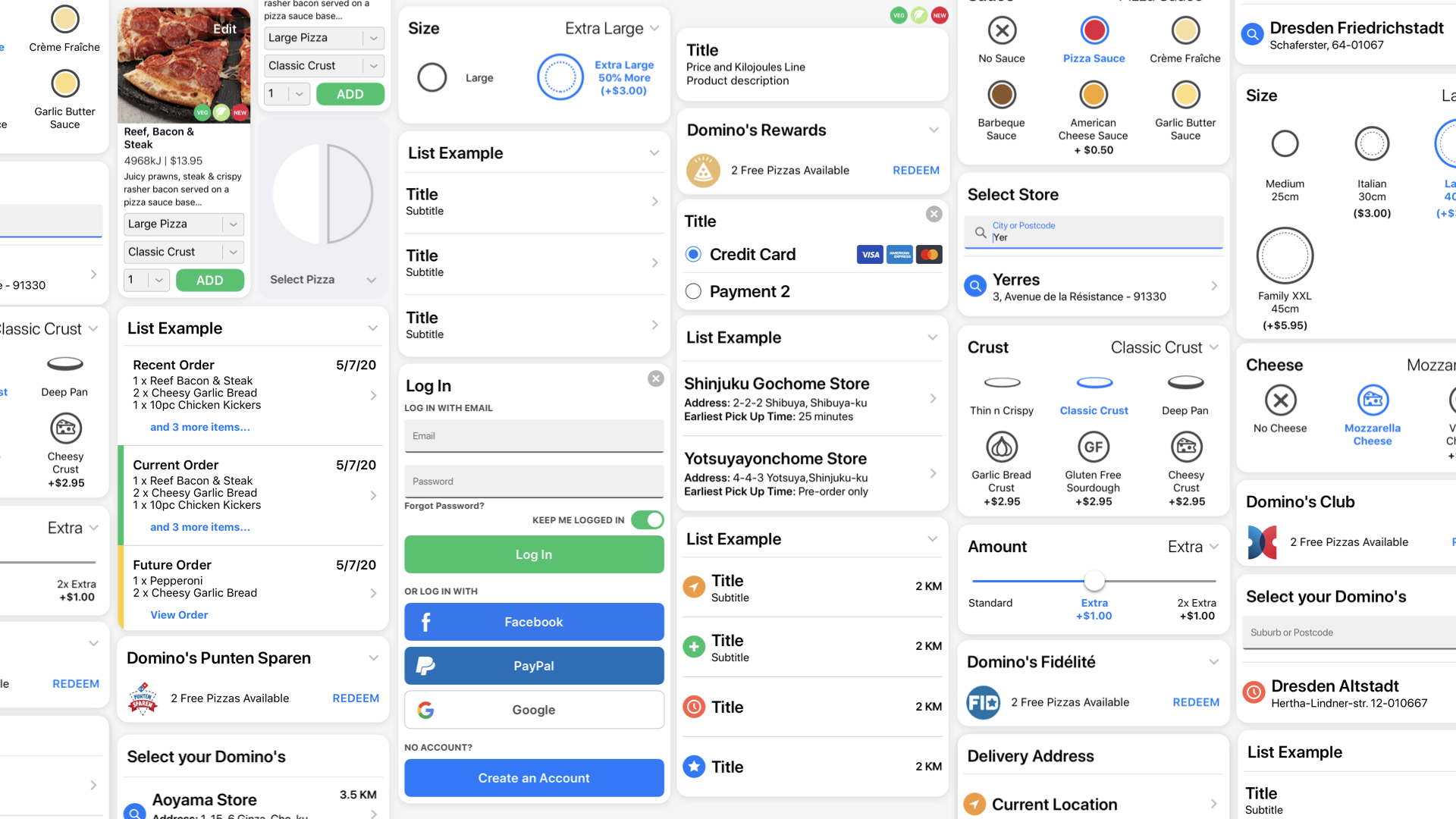
Domino’s Next-Generation Ordering Platform
iOS | Android | Web
A ground up redesign of Domino’s signature online ordering platform and app, built for the next generation of smart devices.
Research
An intensive, 18-month user research and iterative prototyping phase was conducted, with in-house, hands-on user testing of mid-to-high fidelity mockups kit bashed in Keynote and played back on iPad.
Testing was documented through a multi-angle video and screen recording process alongside interviews and in the moment user reflections. Prototypes and user flows were rapidly iterated on between sessions based on this feedback and then re-tested to validate.
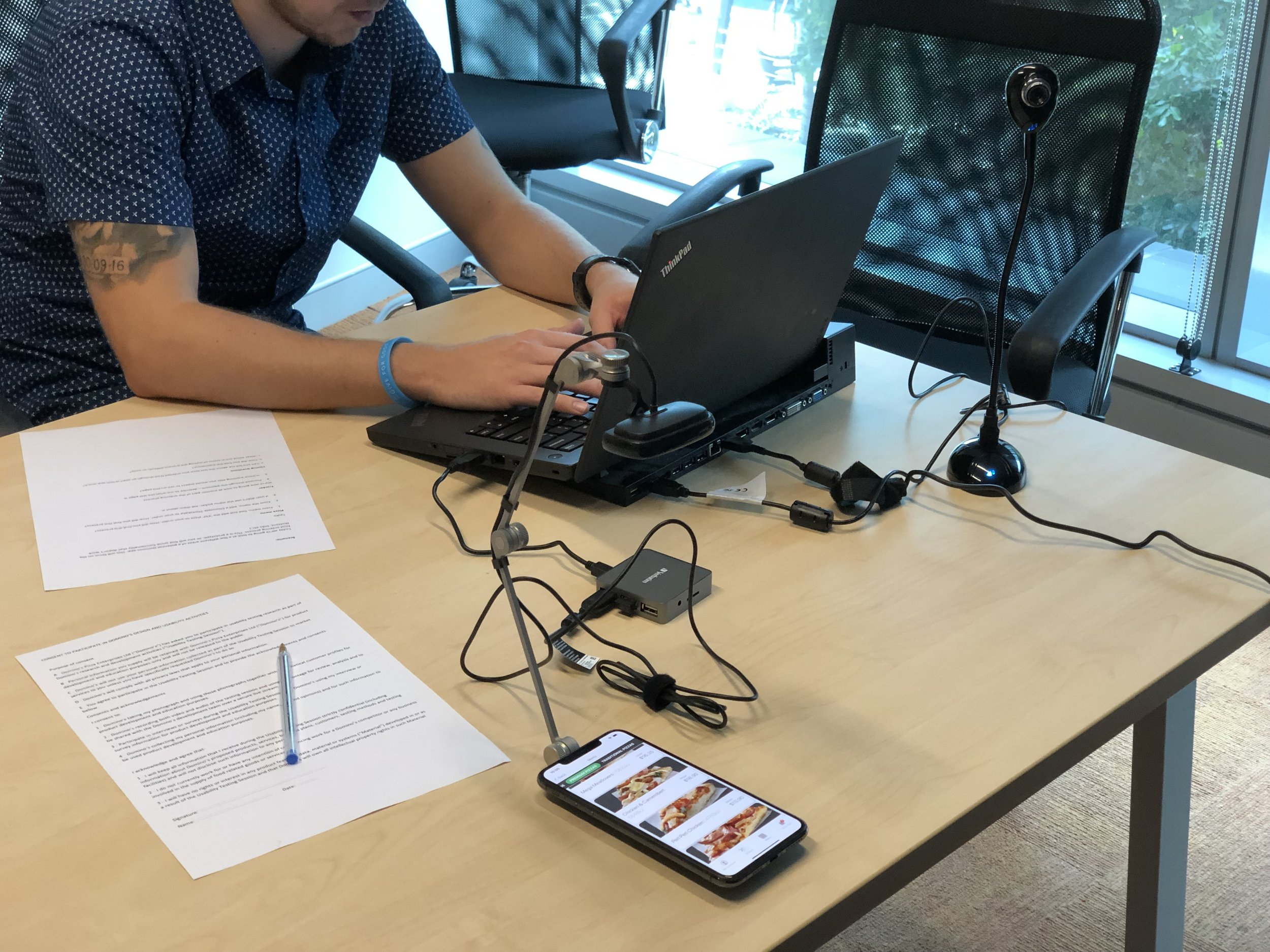
An early Principle prototype is prepared for user testing using multiple cameras and questionnaire.
This was an opportunity to re-consider every element of the platform - down to running a multivariate test to understand which presentation angle and background colour for product images was most desirable to our customers.
As new UI conventions were solidified, they were tested inside the previous generation ordering experience via VWO A/B testing, allowing us to demonstrate positive impact on conversion prior to any development taking place, empowering leadership to confidently endorse the design approach.
During the development phase, larger group user feedback sessions were conducted onsite to validate the execution’s alignment with our research.

An in-house large scale user testing session for a late beta of the app.
High fidelity mockups of key flows built in Principle were presented to the business to get buy-in on the design direction. This was a process of communication - listening to concerns and explaining the “why” and research process that had led to the decisions made. Any substantial changes were negotiated between markets and prioritised accordingly.
Design
As this was a ground-up design, user flows, user interface, controls, iconography and core platform conventions would need to be built out. Anticipating a scaleable future team, and planning rapid iteration workflows lead to the creation of a core Sketch library of UI components and UX structures.
The neutrality of the design language was important when considering a multi-platform approach, with closely aligned user experiences across Mac/iOS, Android and Web.
Consistent conventions across platform makes it easy for customers to move from the web experience to the app - retaining an existing understanding of how the platform works. Minor interface variations were made to adopt platform conventions for corner radii, system fonts and colours.
One of the core goals for this project was to move users from mobile web to the app, where they could have a more feature-rich experience - with robust user accounts, advanced location services, and platform integrations like Live Activities.
Key to all considerations was the internationality of the experience. The design was going to be deployed across the globe, from Japan to France to Australia. Long and short strings of text - and text in kanji (and more common for the brand, katakana) would need to be considered for legibility and line breaks.
Developed during the Covid-19 pandemic, across changing team landscapes - including the transition to both internal and external development partners, I had to ensure designs were delivered to support a relatively ambiguous schedule.
Working with DPE’s internal project management team I mapped out features for prioritisation, and we moved to co-ordinate resources to - as far as possible - support this agreed upon structure.
This was enabled by moving to Sketch Cloud for all designs - meaning we could supply links and early mockups that devs could examine to understand potential scope and update those living documents prior to a formal kickoff to that feature.
We also received positive feedback that this communication gave developers a greater insight into the process, helping build empathy as we moved together at pace.


Development/Design co-ordinated feature prioritisation plan. Forgive the backlighting!
Next-generation ordering platform web
Deployment

Internal testing poster with change log
To maximise our testing scale, an internal beta was rolled out, replacing a lunch ordering web portal. All DPE employees from store teams to CEO were encouraged to give feedback, and sessions were held onsite to capture this. Change logs were posted throughout offices to keep teams aware of updates and to let them know feedback was being actively actioned. This process continued through 8 months of development and was crucial to getting in-the-moment feedback.
The Next Generation experience was rolled out as a web experience in Asia-Pacific and some EU markets initially, with traffic split between it and its immediate predecessor.
For those customers using the new experience, conversion increased 12-20% during the first month of testing. This gave the business confidence to rapidly roll out web and app across all markets, with the final market, Japan, coming online 8 months later (due to support requirements for many regional third party payment platforms).
Sales were boosted substantially, with the new experience being largely responsible for online sales breaking $3 billion for the first time ($3.06 billion, but why quibble). The new experience also led a surge in online vs in-store/phone sales, with three quarters of sales now coming from online platforms.
POST RELEASE
As development got underway, my team was pushing forward with feature enhancements, new features and new form factors.
Features included:
Enhanced transition animations
Refreshed menu designs with bigger images and less up-front text.
App-wide dark mode support on iOS, Android and Web
Drop-pin delivery to any set of coordinates
A refreshed delivery tracker with native, platform specific maps integration, including 3D maps on Apple devices.
Integrated deals and offers specific to the order type.
Revised payment flows with Apple Pay checkout from the menu.
Live activity support
New form factors included:
iPad specific views including overlays and native side-menus
Better support for full screen displays
Foldable form-factor support with multiple bespoke views and updated Material 3 components
In-store kiosk support with integrated POS checkout flows
Additionally, we supported an in-house A/B testing strategy to quickly validate and implement new designs across web and app platforms.

Early testing mock-up of the new Domino’s app for iPad.

The next-generation web experience running on kiosk hardware.
Early testing of the New Domino’s app user flows on Apple Vision Pro
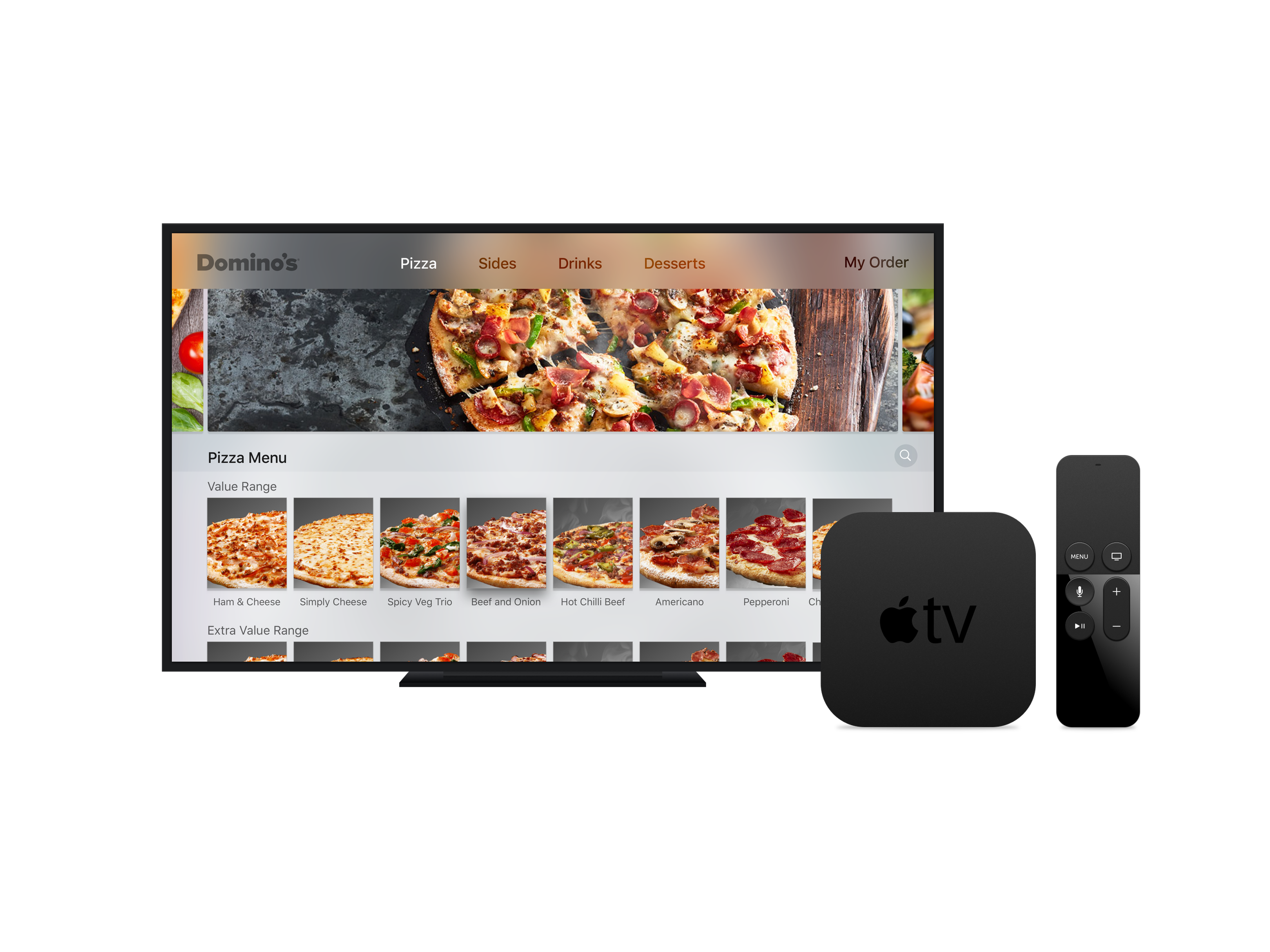
Screenshot of a functional prototype I assembled in TVML for a tvOS version of the Domino’s app, referencing hosted assets.

The New Domino’s app reskinned with US Domino’s brand guidelines
New Pizza Chef with Augmented Reality™
iOS | Android | Mac
Bringing the chore of customising a pizza to life in a joyous explosion of colour and fun in this groundbreaking, award-winning AR experience built in partnership with Deloitte.

Promotional video for Domino’s New Pizza Chef with Augmented Reality™
Research
Towards the end of 2019 there was interest in the business around exploring gamification, and the concept of an augmented reality experience was floated as a stand-alone app akin to Pokemon Go.
Focus groups and user research lead us to an experience that was more core to the process of ordering pizza - that enhanced the somewhat mundane task of customising the product by putting your pizza on the surface in front of you.
Rather than being stand-alone, this new experience would be integrated directly into the ordering app,
Design
With a short, 6 month turnaround time, and Deloitte handling development, New Pizza Chef would also be the first place in the Domino’s app where the Next Generation user interface would be implemented. Core conceits such as the card based UI and new universal navigation colours were adapted for the AR experience, with a new swipe-navigable ingredient picker added to keep all customisations under the user’s thumb. Adding or removing an ingredient was a single, seamless gesture.
For hardware that didn’t support ARKit (or for users who didn’t feel like assembling a pizza on their bathroom floor) a toggle was added to turn off the camera, and display a neutral background. Detail was focused on, with an eye to how animations effectively communicated customisations to the product and had an element of tactility and joy. Custom Easter Egg 2D animations were created for specific ingredients that encouraged users to explore and have fun.
Joy is often a hard to quantify metric, but it was always an understanding that New Pizza Chef should exude it.
Deployment
Released as an upgrade to the Domino’s ordering app, New Pizza Chef with Augmented Reality was recognised by International Data Corporation (IDC) in the 2019 Digital Transformation (DX) Awards in the category of Omni Experience Innovator, alongside experiences from Proctor & Gamble, Disney and Citi Group.
It went on to win overall winner for its category, globally.
More importantly, it was a beloved feature - repeatedly called out in reviews by our customers as surprisingly great, fun to use experience.
From a business standpoint, customers highlighted that they were encountering ingredients and configurations they hadn’t even been aware of, just by playing with New Pizza Chef - and, more importantly, customers who created a pizza in New Pizza Chef were extremely likely - almost certain - to convert.
With the availability of iOS apps on Mac, New Pizza Chef with Augmented Reality was updated with new, higher resolution textures and arrived as part of the Domino’s app in the Mac App Store.
As of 2023, New Pizza Chef with Augmented Reality is awaiting a return in the next-generation ordering app, with expanded availability across all Domino’s markets.


DRU Assist™
iOS | Android | Web
Partnering with Nuance, I designed the interface, character, animations and conversational structure for this early, yet extremely advanced chatbot.
I demo DRU Assist™ in this press kit/social media asset.
Research
In 2016, Nuance approached Domino’s with the idea of integrating their Nina chatbot technology with our online ordering platform. At the time, Siri intents were still 18 months away and Google Assistant was nascent, so the decision was made to adapt Nina into Domino’s own, online voice ordering assistant. At this time Nina had seen some deployment at the Australian Tax Office and Virgin Airlines, but had never been integrated as a full screen native experience on mobile - and had never been used for a product as complex as fully-customisable pizza.
What would emerge from this project was a product of its time - both in its scope and, ultimately - limitations, but the ambitions and accomplishment of DRU Assist renders it beyond a toy or a gimmick - an impressive, but ultimately flawed halo product
The scope for this project was huge and perhaps untempered. DRU Assist would be able to select a service method (carryout or delivery), the selected store (if carryout) the correct address (if delivery), the time for the order (ASAP or a specific time and date) and then an order of as many pizzas (theoretically limited at 20) with as many customisations of crust, sauce, ingredients as the user wanted, calling from a menu with both recipes and the ability to create a completely custom pizza - with rules around maximum numbers of toppings to prevent undercooked product, and select sides, and select drinks, and select desserts, then propose additional items, then apply any voucher the user may have, then add the order to the user’s basket and check out.
Additionally, the experience should be able to be launched at any point in a traditional web or app user flow, pick up that user’s basket as-is, and be able to customise, change and add its content.
On top of this, DRU Assist was expected to have a personality - the marketing team was fixated on Siri’s cheeky responses to certain questions and felt these “pushing the limits” moments were critical to have in the product from day one. DRU was to be able to make jokes and comedic responses at any point in the ordering flow.
Further, DRU Assist would be able to take typed and spoken input, with low-latency speech recognition, and spoken responses.
This was the MVP scope as determined by the global leadership team, and with Nuance’s assurances, we committed to an 8 month development timeframe.
Working alongside an onsite team from Nuance and a DPE product team, we exhaustively mapped the customer journey tree, workshopped synonyms, put together a blocklist of unacceptable words while I started work on UI.
Biweekly meetings with the US team assured us that backend performance enhancements and the activation of local server infrastructure would reduce latency and improve the quality of speech recognition.
Design
DRU Asist was an extremely hush-hush project, so user testing was conducted almost entirely internally, with long afternoons of sit-and-test sessions set up in the head office break room. Early mockups were pulled together in Keynote based on Sketch files - this let us simulate the conversation with audio files generated by TTS on MacOS.
Conceptual wireframes of the design prototyped putting DRU at the top of the screen and having the conversation flow down towards the user, but this was abandoned in favour of a scrollable chat history - ostensibly to allow the user to troubleshoot if something went wrong in the speech or text recognition. The user interface was originally prototyped in Domino’s red-and-blue, this was changed to yellow and white - both red and blue deemed to emotive for a conversation flow.
As we began to user test with the Nina chatbot plugged in to the interface, we began to see substantial lag and some challenges with speech recognition accuracy. To compensate for this, I added inline buttons for every decision that DRU Assist presented - so rather than say or type “yes” or “no” the user could quickly tap to confirm. This also gave the customer a quick and clear button to hit if we got it wrong.
Where possible, we used system fonts to appear platform neutral, with limited appearances of Domino’s brand fonts, which were less legible in smaller sizes.

DRU Assist on an iPhone
The DRU character itself was designed to be sleek, modern, expressive and fun - a close sibling to an autonomous delivery robot the business had prototyped a year prior.
After playing with more organic forms I settled on a three element design, featuring the white shell, black front panel and big, expressive blue eyes. Moving the shell and front panel separately gave the 2D sprite a sense of dimensionality, and this movement combined with the ability to tilt left and right captured the expressive friendliness that brought DRU to life. We wanted to keep an element of the robotic to the design - to set clear user expectations and not over promise on interactivity. Rather than attempt lip-sync, DRU’s responses - listening, thinking, speaking - would map to the illumination of its eyes. .

To bring DRU beyond the app and web experience, the existing vector assets from Sketch were upscaled and imported into Adobe Character Animator (then a very early beta). These were then rigged and mapped onto a facial animation performance system, allowing an actor to drive the position of DRU, with the front and back planes of the face on a spring system, allowing one to lead the other - maintaining the three dimensional effect. The actor’s vocal performance was mapped to the illumination of the eyes through and A/B alpha channel - the relative simplicity of this allowed us to keep a very high frame rate for live performance.
Though initially planned to create bumpers for TVC, executives were so impressed with DRU’s performance that (against a new chroma green background) the digital puppet co-hosted the 2017 Domino’s Rally, the first use of Adobe Character Animator in a live stage event. The DRU digital puppet would go on to feature in TVC, social content and a Youtube video series.
Deployment
DRU Assist was launched with a live stage demo at Domino’s Abacus 2017 technology event.
Having been onsite for the 24 hours preceding, stress testing venue connectivity, troubleshooting the thousands of paths a demo can take that end in news-making and embarrassing mistakes - I had worked with Nuance to craft a script that (connectivity, comprehension and local weather prevailing) DRU Assist could complete successfully, repeatably.
Two hours before the demo, with the media filing in, DPE’s marketing team decided that the pizzas for the order DRU was to place would be selected at random from suggestions by the audience. This dramatically increased the opportunity for failure for a product that was - on its best day - in late beta state, and not due to be released for another month. The moment arrived, our global CEO took the stage and compared what we had accomplished to Siri and Google Assistant, and handed over to our team for the demo.

Example of DRU Assist handling a typical user flow.
The audience was polled and came up with a Vegorama, no capsicum, on a thin crust. There was a brief pause while DRU Assist thought about the instruction, and then successfully identified and added the pizza to the order. Enormous relief for myself, the team of Nuance engineers backstage, and Domino’s.

DRU Assist successfully completes the hardest part of any project - the stage demo
DRU Assist captured the imagination of the Australian news media, and was featured in QSR articles, radio, television and YouTube, in addition to appearing on full-colour print pizza boxes. I had my brief moment of fame as the user in the recorded demo sent out in the press kit.
DRU Assist would continue to take orders (though, ironically, our analytics showed mostly typed) as a web and app integration until early 2019, when the groundwork for a new app and website meant the retirement of features that weren’t critical to the ordering flow.
It remains a strikingly feature-complete and technically impressive artefact of its moment in time, an exciting moonshot project that I am proud to have been part of.
DRU Assist™ promotional video (sequences shortened) including the DRU digital puppet in the opening card.

DRU Assist appears on a promotional pizza box.
Alexa & Google Assistant Integrations
Amazon App | Android, iOS | Alexa & Google Assistant
As Alexa was rolled out across DPE markets, I lead the project to bring Domino’s ordering and order tracking to both Amazon’s voice platform and Google’s Assistant.
Alexa skill social media promo video, with blurry acting cameo by the designer.
Research
Prior to the launch of Alexa™ in Australia, Amazon approached DPE to develop a skill for the platform. Working in concert with VERSA, a specialist agency in Melbourne and a consulting team from Amazon, we moved fast to capitalise on promotional synergies from being a day-one presence on the platform.
I was important, however to understand why we were on the platform, and in concert with insights from Amazon and our Domino’s US partners, we established the two critical pathways for the skill - placing a saved quick order, and tracking the status of that order once placed.
Design
We started by mapping out the user flows for the skill, associated terms - including some regional quirks in dialect we hadn’t anticipated. Though some DPE platform limitations meant full customisation and creation of a new order was not possible, the ability to order a past order in addition to a saved quick order was found feasible within the tight pre-launch timeframe. We challenged our team to deliver this as part of our 1.0 release, and the skill was in validation with Amazon within our 14 day build time. Our first pizza order was successfully delivered to VERSA’s offices in Melbourne by the approved skill 4 days later.
During validation we were approached by Google to port the experience to Assistant. This was a 1/1 translation handled by VERSA, however we would now need assets to support devices with screens. I produced these across all appropriate screen sizes, and provided updated creative to start supporting the Amazon Echo Spot, which launched about 8 months after we released the skill.

The Domino’s Alexa skill running on pre-release Echo Spot hardware
Deployment
My team had an incredibly short period to develop, validate and approve the skill with internal stakeholders, our development partners at VERSA, and our contacts at Amazon working together across three timezones.
Our Domino’s ordering skill was the fastest end-to-end developed skill on the Alexa platform, and was considered compelling enough that it was featured on the Echo Dot packaging in APAC and EU markets, and was the highlight of a national outdoor campaign.

Domino’s Alexa skill billboard ad

Domino’s Voucher & Runout Tools
Web / Internal Tool
A trial-by-fire for our new design language - a foray into an internal tool. Design goals of a dramatically improved user experience for franchisees and DPE’s marketing team ran alongside a business requirement for full legacy feature support from an almost twenty year old tool, as it was expanded to 10 additional markets
Research
DPE’s existing stock and voucher management tools had become a pain point for franchisees and global marketing teams. Created with a functionalist view to interface, with little to no user research, it was challenging to use efficiently, with backend complexity contributing to a sluggish and frustrating experience. While a new more performant backend was not on the cards, a refreshed, modern web frontend was seen as the most expedient way to a faster, friendlier tool.
Scope was already established by the existing product. Though some features were considered legacy by the business initial investigations revealed they were still in use (we used the gating criteria of >5% of users more than twice a month actively using the feature). We did however put together an analytics-driven retirement list for under-utilised features as a runway to progressively simplifying future scope.
One of the challenges for this project was the diverse range of users. This included power users already extremely familiar with the existing solution, casual franchisee users who would only engage with the tool when an ingredient was out of stock, and new users, who struggled with the complexity of the existing tool.
This would be deployed not just in Australia and New Zealand, but 10 further international markets. As a result, string length varied wildly - not just in product names but also in titles and CTAs. Translations would be managed through Locize and tested exhaustively by my team.
Adding complexity was the variety of supported devices.. While the legacy tool was limited to desktop web browsers (specifically Internet Explorer), this new version would need to support modern web browsers and mobile screen sizes on iOS and Android.
Design
Following an extended period of hands-on testing of the existing tool, observation sessions of existing users in store environments, and full end-to-end user journey mapping, I broke down what elements could be produced with existing components from the Domino’s Design System, and what new design would be required. The more data-dense elements of the Voucher and Runout Tools would need a cell-like structure, but we resisted a table view, as this didn’t give clear legibility. and wasn’t friendly for a mobile user. We settled on a structure that gave every item its own button-like cell, with big, easy to tap controls. This made the list view longer, but in testing we found editing multiple items simultaneously was an extreme outlier, and more likely to be done in a head-office context on a larger display.
Anchored bottom of view controls made it obvious how to save and cancel an edit, and CTA colours flowed through from the Design System for pleasing, accessible continuity.
For editing stock or vouchers for multiple stores, we developed a chip system that could be used to quickly select a whole market or store group, and edit that down to a shorter list if required. This was a debated design choice as store names could have a substantial string length, but by using this format instead of another table-style view we could clearly delineate functional areas, and reduce the potential for monotony or incorrect input.
Deployment
The new Voucher and Runout Tools were deployed on a intra-market basis, first across Australia and New Zealand, then Japan finishing with a staged roll out across Europe, interfacing with the team there to troubleshoot any line-wrapping or string length related issues - which ended up being minimal. Though the new tool didn’t resolve the majority of the backend challenges, the new front end was lauded by franchisees for being accessible and easy to use for new employees - taking a substantial load off managers and franchisees. Though this did not have specific success criteria, usage of the tool in Europe and Japan resulted in dramatic improvements in stock management and customer satisfaction.

Domino’s Zero Contact Pick Up & Delivery
iOS | Android | Web
Working under extreme deadlines with a rapidly evolving global situation, I partnered with multiple internal and external stakeholders to introduce user flows and processes that allowed the business to continue to trade while retaining customer trust.

Research
As a business operating across 13 global markets, Domino’s had to react quickly to the unexpected and rapid spread of Covid-19. As DPE’s Asian markets began to feel the pressure of swelling case numbers and rapidly introduced sweeping public safety measures, the business had to act quickly to put together processes to keep customer trust, ensure employee safety, and continue to safely operate during this period of heightened risk.
I was part of the Domino’s global Covid-19 working group, meeting twice daily during this period.
Multiple approaches for customer communications were produced during this time, alongside an evolving understanding of what requirements would be, both legally, logistically, and what was realistically implementable with tight timeframes.
Design
It was decided, in consultation with government stakeholders, that stores would implement social distancing, and where possible move customer pick up outside, with no direct contact between employees and customers. For delivery, a no-touch approach would be adopted, with products being left on an additional “safety” box to prevent floor contact. In Asian markets, a small stool was used to accomplish the same effect - retrieved once the customer had collected their meal.
Several customer-facing names were proposed for this approach, with business choosing to adopt Zero Contact™ as the brand.
Given the time constraints no external agency was contracted for collateral - instead I created all brand and marketing materials for this project.
The approach was built around a new key considerations - the business wanted to emphasise the “no hands” element of the delivery process, but I was concerned around using a standard hand icon that could be misconstrued as “stop” - which might instinctively deter a customer from ordering.

The solution was to incorporate the musculature of the thumb - this clearly differentiated and humanised the design from the traditional, flat “stop” hand. At the same time the decision was made to not encircle or frame the icon - reducing complexity and staying away from the language of stop signs. Instead a single line of the same weight cleanly bisected the hand - with continuity on the lower half so as not to “split” the hand.
This included all physical, instructive print, both employee and customer facing, digital touchpoints throughout the ordering platform, explainer microsite and integrations. I then supervised the translation of these assets for all markets, leading with Japan, France and Germany.
Once deployed globally, I handed comprehensive branding assets off to our media creative agency for extension into an animated TVC/Mobile Video campaign.
Deployment
Zero Contact™ was a huge success for Domino’s, deployed extremely early in the pandemic and largely duplicated by our competition - including larger rivals - right down to branding.
Due to the comprehensive and clear nature of the implementation, and the consultative and evolving process we deployed, the business was allowed to continue to operate in all markets without shutdown (excluding a brief period in New Zealand), providing a service to customers throughout the darkest days of the pandemic - including during lockdowns.
Sales grew by over 12% globally, with markets where restrictions were tightest - such as Japan - seeing enormous sales growth of 29%. This was a testament to the value of clear communication and customer trust.
Crucial to maintaining customer trust and showing a business commitment to doing the right thing with the best of intentions under extreme pressure, and I remain extremely proud of the work we delivered under the tightest of deadlines.
Domino’s Japan AR Size Guide
iOS | Mac
With the introduction of a new, larger pizza size, Domino’s Japan needed a way to clearly communicate this product in a pandemic-weary world.

Early USDZ of the model, displaying AU sizing (isn’t ARKit awesome?)
Research
Up until the summer of 2019, Domino’s Japan just had two pizza sizes, “medium” and “large,” but that August the chain added “regular”.
Ordered by ascending size, pizzas went medium, regular, large (yes, I know.)
In early 2021, the decision was made to introduce two additional sizes, the returning “New Yorker” and the new “Ultra Jumbo”. (yes, I knoooooooow.)
The sizing would therefore be, Medium, Regular, Large, New Yorker and Ultra Jumbo.
With some lockdowns and restrictions on travel still in place, DPJ needed way to meaningfully communicate these sizes to customers without being able to show them in person - as customers were overwhelmingly electing for delivery.
I proposed a web-launched ARKit experience as a very effective, very affordable way of bringing this to life.
Design
Multiple iterations were produced in Trimble SketchUp, exported as .OBJ into Reality Converter and retextured for .USDZ. Wherever possible I modelled text and patterns into the model itself - as this meant users could get as close to the model as they liked without a loss of fidelity. I made the decision to use a brushed, highly reflective material for the pans as this looked clean and food safe - but also to show off ARKit’s phenomenal material rendering.
Designs were approved by DJP’s marketing team, and checked against the actual pan sizes in store to verify 1:1 accuracy. Multiple configurations were tested, with and without Ultra Jumbo and New Yorker sizes.
Deployment
The experience was launched via a Japan-team landing page and substantial television and print marketing.
In February 2023 Domino’s Japan changed Medium, Regular and Large to Small, Medium and Large.
Domino’s ZeroClick™
iOS | Android
A fast-follow with a new face, ZeroClick™ was an exercise in rapid iteration, in-hands testing and design integrated development.

Domino’s US Zero Click ordering app

Principle mock up of the DPE ZeroClick™ app
Research
Domino’s US announced Zero Click ordering in April 2016 as part of their Anyware initiative. Opening the Zero Click app would initiate at 10 second countdown, at the end of which a preselected fast-favourite order would be placed.
Based on the positive media buzz around the app, DPE looked to implement its own version. Differences in ordering platforms ruled out licensing the existing app, so Domino’s ZeroClick would be a fast follow, looking to address concerns voiced by the US media around accidental ordering.
An iOS 10 era moratorium on skeuomorphic design, and a desire to be closer to the DPE version of the Domino’s brand meant that this would be a ground up redesign, based around the core conceit of the US app.
Design
Coming Soon
Deployment
ZeroClick was announced at Domino’s Abacus tech conference on the 16th of June 2016. Shortly after it was rolled out to iOS, then Android in late September. It was praised in the media for being easy to use, highlighting differentiating security features, and clean, cool design. Though it had a relatively niche use case (customers had to have an account and a saved order and a saved payment method) downloads were strong, with the app seeing solid ordering numbers through the summer of 2016.

Final ZeroClick™ app promo image
Domino’s New Public Website (2023)
Desktop & Mobile Web
A refresh of Domino’s homepage to include a new brand font and product photography.

Research
At the beginning of 2023, DPE switched marketing agencies and wanted to immediately move away from the corporate “Pizza Press” font to a bold, clean (all caps) Futura based design. Product photography and brand design would change radically and quickly during this period, moving to a big focus on product, darker backgrounds, and striking key visuals - cheese pulls, ingredients and steam.
Design
Moving with the new brand direction, I dramatically simplified the UI, removing extraneous buttons and links that didn’t relate to conversion. This also gave an opportunity to clean up the website’s footer to a clear, structured approach to that data. Key visuals fill the canvas, flowing under the header and deal text.
Clear controls carry key colours from the Domino’s app back into this space for a consistent user experience regardless of entry point.
We deferred to analytics and heat maps to understand where our users were tapping, and from this understood that the service selector (delivery or pick up) was the heart of the page. This design was retained and expanded for desktop, and made more prominent and legible on mobile. Although design’s preference was to move it on mobile to under the first offer (and thus closer to the user’s thumb) the business made the decision to retain its hierarchical position.
Deployment
This design is under active development with a view to a late 2023-early 2024 launch.